Please adopt suitable charts to display different types of data. Here are some tips for reference.
Bar chart
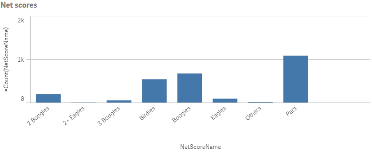
When to use it
The bar chart is suitable for comparing multiple values, e.g. amount of sales by country.
Advantages
The bar chart is easy to read and understand. You get a good overview of values when using bar charts.
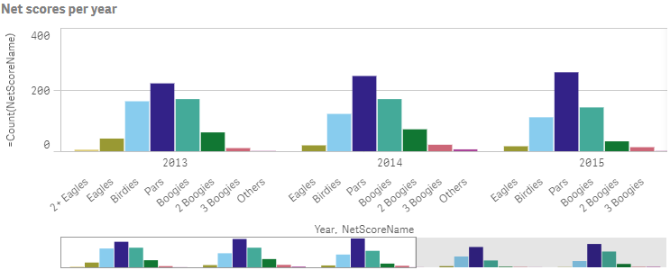
Grouped bar chart
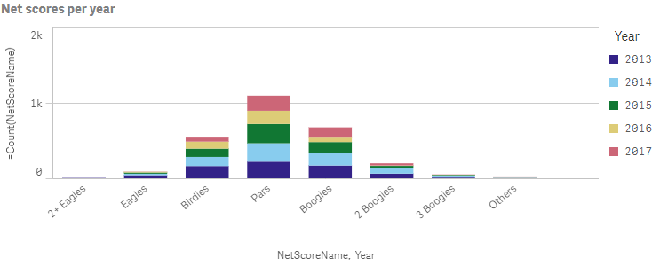
Stacked bar chart
When to use it
When you have two dimensions or more.
Advantages
You can easily compare two or more items in the same categorical group.
Disadvantages
The bar chart does not work so well with many dimension values due to the limitation of the axis length. You can scroll using the scroll bar, but then you might not get the full picture.
Line chart
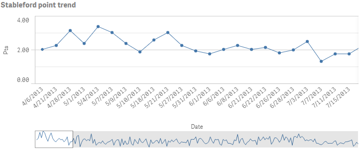
When to use it
The line chart is primarily suitable when you want to visualize trends and movements over time, where the dimension values are evenly spaced, such as months, quarters, or fiscal years.
Advantages
The line chart is easy to understand and gives an instant perception of trends.
Disadvantages
Using more than a few lines in a line chart makes the line chart cluttered and hard to interpret. For this reason, avoid using more than two or three measures.
Pie chart
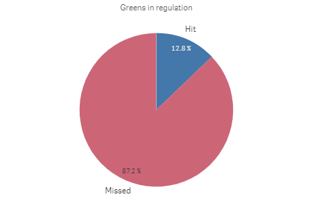
When to use it
When you compare a certain sector to the total. The pie chart is useful when there are only two sectors, e.g. yes/no or male/female.
Advantages
The pie chart provides an instant understanding of proportions when few sectors are used as dimensions. The number of sectors should be less than 10 to keep its visual efficiency.
Disadvantages
It may be difficult to compare different sectors of a pie chart, especially a chart with many sectors.
Combo chart
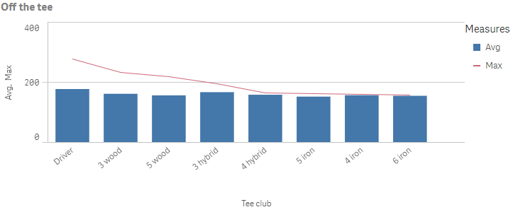
When to use it
When you want to comparing different values of the same value range to show the relationship between the two categories of data.
Advantages
The combo chart is the best choice when combining several measures of different value ranges.
Disadvantages
The combo chart only supports one dimension, and can therefore not be used when you need to include two or more dimensions in the visualization.
Gauge chart
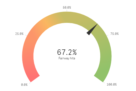
When to use it
The gauge is often used to present KPIs when the maximum, minimum, and target values are known to support the interpretation of the value.
Advantages
A gauge is easy to read and understand and gives an instant indication of the performance.
Disadvantages
It requires a lot of space to display.
KPI
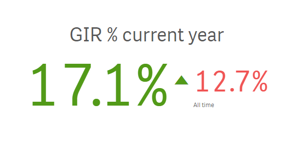
When to use it
Use KPIs to get an overview of performance values. Use color coding and symbols to indicate how the figures relate to the expected results.
Advantages
KPIs give a quick understanding of the performance within an area.
Disadvantages
The KPI is somewhat limited when it comes to graphical components.
Table
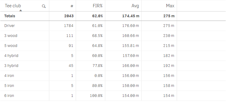
When to use it
Tables are good when you want to compare individual values. Drill-down group dimensions are very efficient in tables. Within a limited space, you can drill down to the next level of detail.
Advantages
You can filter and sort the table in different ways. A table is excellent when you want to see exact values rather than trends or patterns.
Disadvantages
If the table contains many values, it is difficult to get an overview of how values are related. It is also hard to identify any irregularity within a table.
Tree map
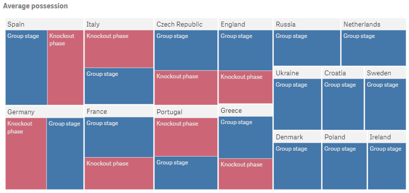
When to use it
Use a treemap when space is constrained and you need to get an overview of a large amount of hierarchical data.
Advantages
It can be used within a limited space and yet display a large number of items simultaneously.
When there is a correlation between color and size in the tree structure, you are able to see patterns that would be difficult to spot in other ways.
Disadvantages
Treemaps are not good when there is a big difference in the magnitude of the measure values. Negative values cannot be displayed.
Scatter Plot
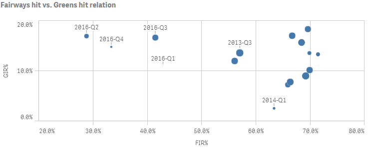
When to use it
The scatter plot helps you find potential relationships between values, e.g. average life expectancy and income in different countries. You can also find outliers easily.
Advantages
The scatter plot is a great way to visualize the correlation of two or more measures at the same time.
Disadvantages
The scatter plot may be difficult to understand for an inexperienced user. Values is not visible until you zoom in.
Pivot Table
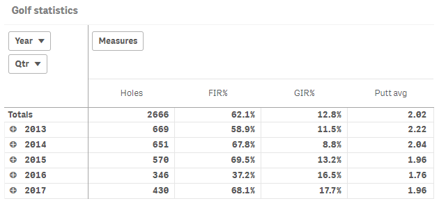
When to use it
The pivot table is particularly useful when you want to include several dimensions or measures in a single table, and then want to reorganize them to see different subtotals.
Advantages
The pivot table is very powerful when you want to analyze multiple dimensions and measures at once, and then reorganize them to get a different perspective. You can expand the rows you are interested in while keeping the rows in the rest of the table collapsed.
Disadvantages
The pivot table may seem a bit complicated, and does not give insights at a glance.